Crossways Community Creche
Logo design, brand identity, and marketing materials for a Wellington childcare centre
Logo design, brand identity, and marketing materials for a Wellington childcare centre
Crossways has been a beloved childcare centre in Wellington since 1979. However, their existing brand had become outdated and lacked the versatility needed for modern applications.
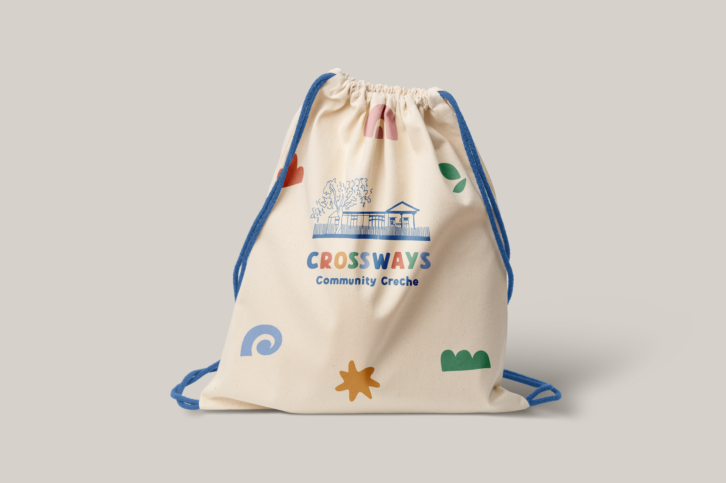
For their rebrand, I aimed to create a logo that was both professional and playful - capturing the essence of education, inclusivity, and care while reflecting the creche's longstanding connection to the local community.
The solution centres on a hand-drawn sketch of the iconic Crossways building itself. Paired with bold, colourful lettering, the design balances warmth and energy with the professionalism expected of an educational institution. The result is a crisp, adaptable identity that honors the creche's heritage while positioning it confidently for the future.
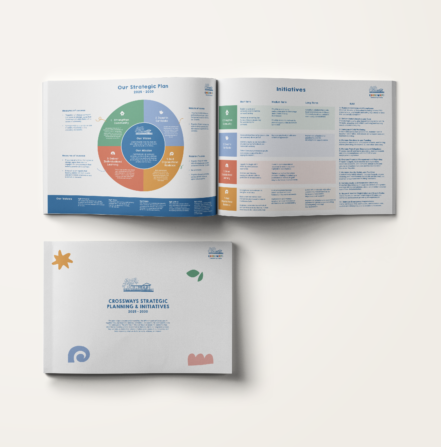
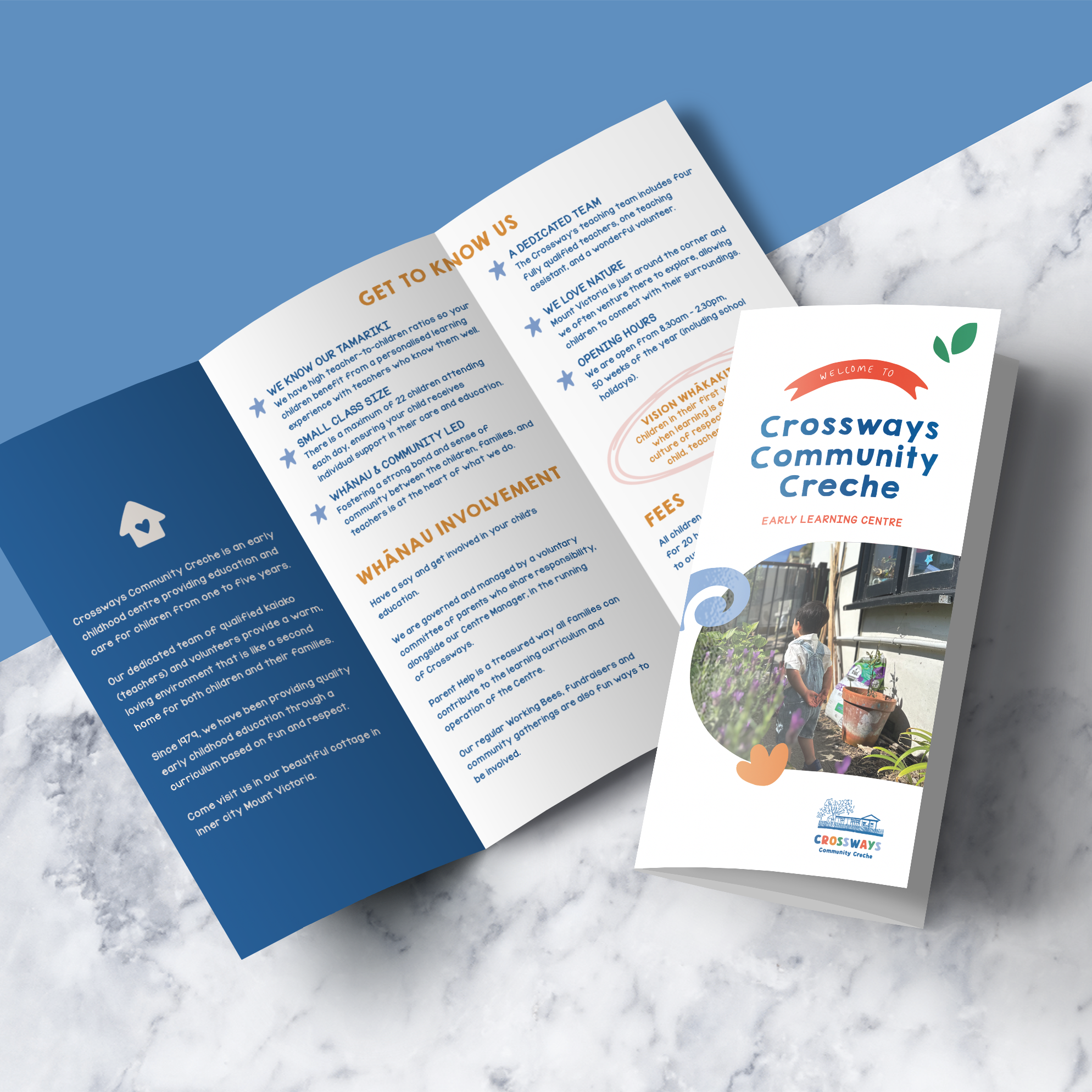
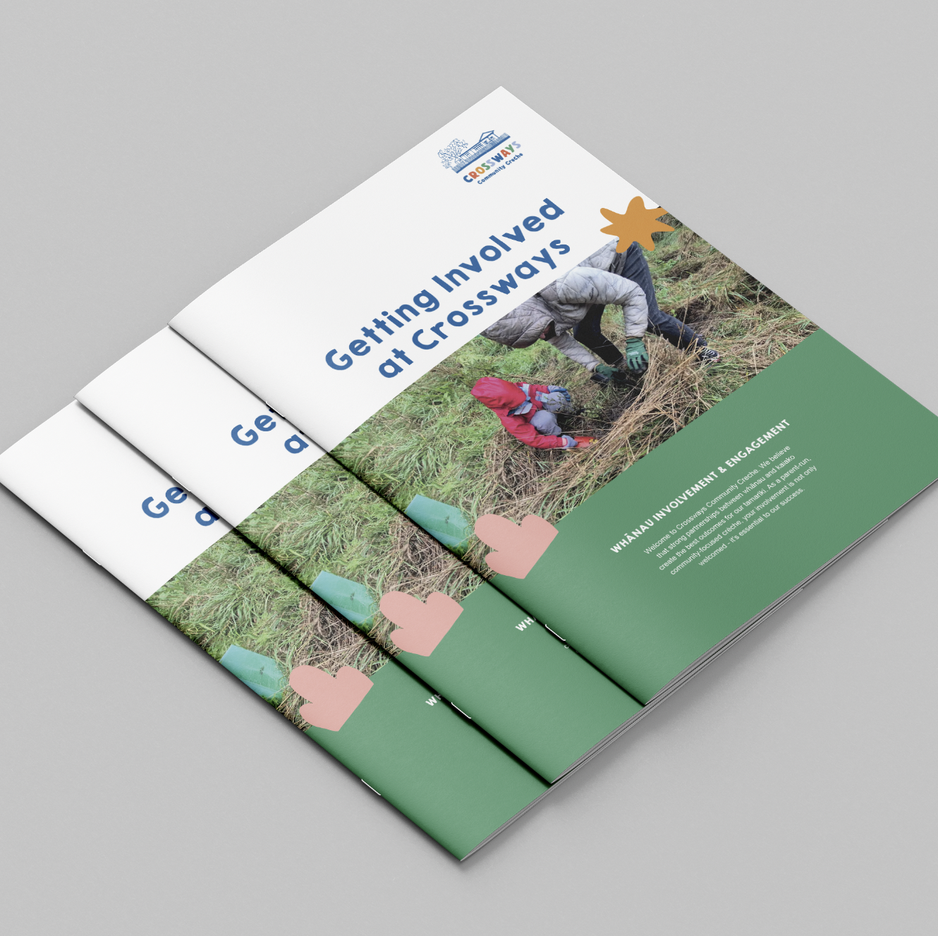
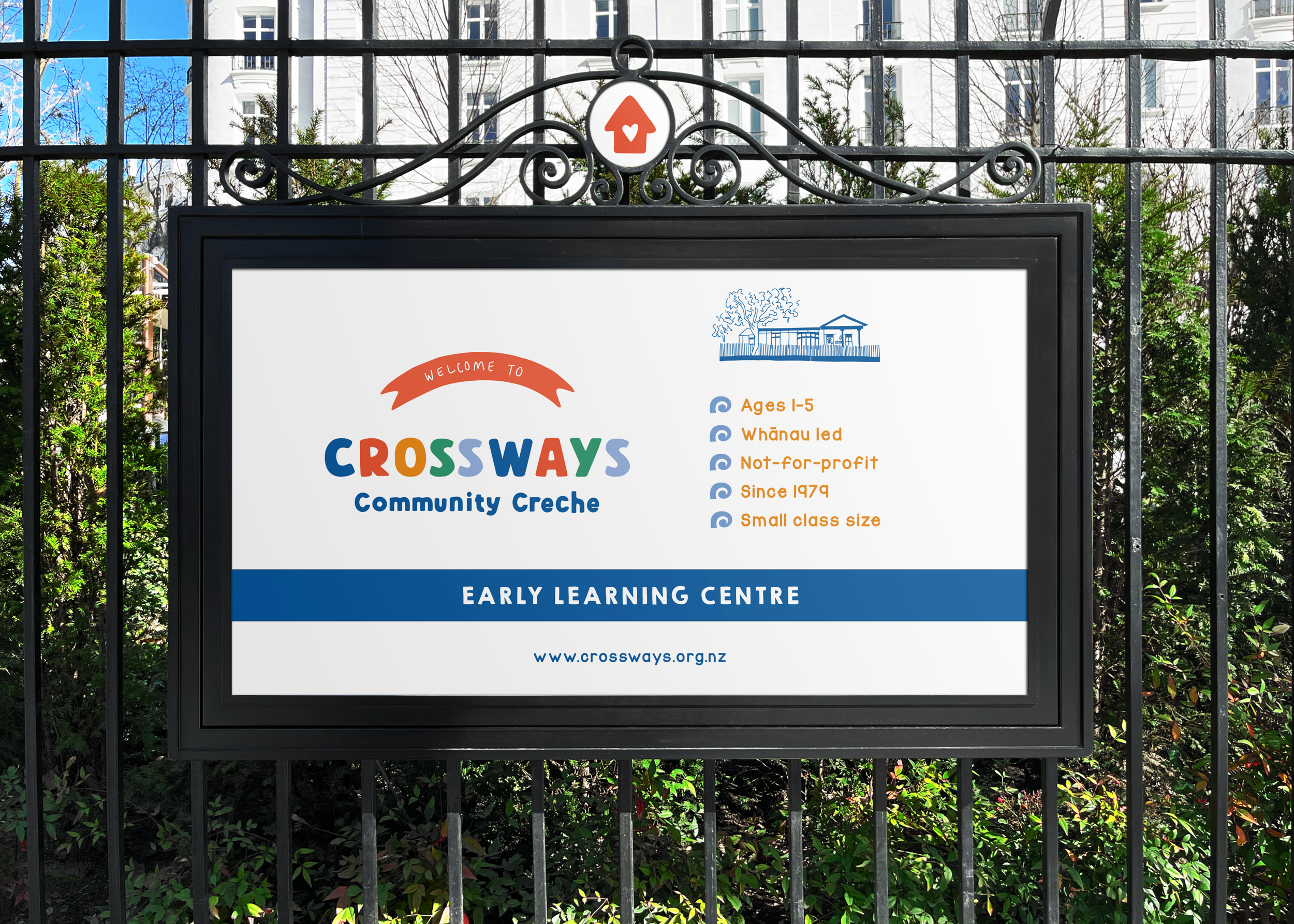
Following the creation of their brand, I then designed their website, marketing materials and strategic plan.

Marketing Materials and Reports